Redesign
Along with Moody’s and S&P, Fitch Ratings is one of the Big Three credit rating agencies. The content it produces is delivered at great expense to subscribers by Fitch Solutions through FitchConnect, a B2B product conceived and produced by a handful of business and technical people in 2015. None of them were designers. The result was an all-too common one. Inscrutable workflow and poor retention had become the product’s hallmarks. In 2019, the technical manager and I endeavored to change all that. Together we not only transformed the product, we transformed the organization.
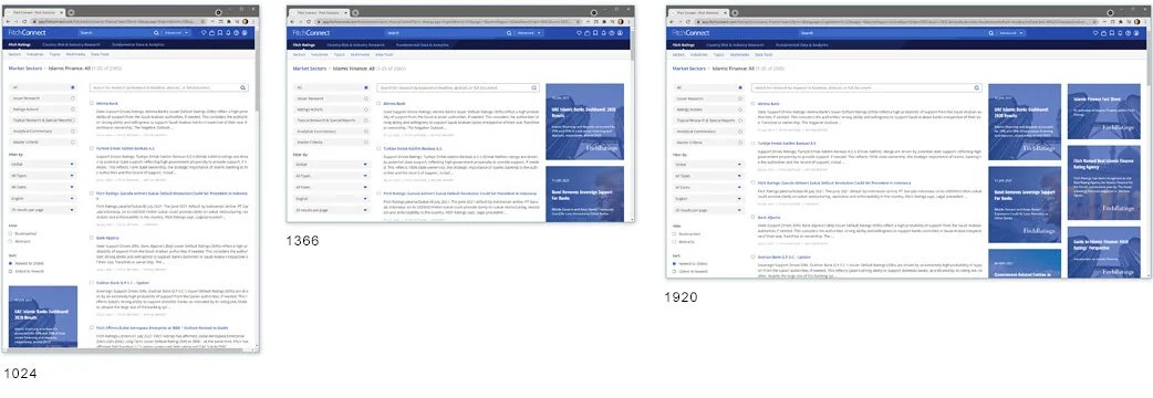
The Most Used Page
I personally designed every single aspect of this critical and ubiquitous screen. From the header to the footer and everything in-between. For its Visual Design, every color, font, layout and image choice, including three discrete responsive states. And for its Interaction Design, every affordance, signifier, and behavior. This view is the last stop for analysts on their way to research that will guide million-dollar decisions routinely affecting global markets, foreign governments, and regional economies.
( The below four screenshots were taken directly from Production on July 7, 2021 )

Redesigning Video Delivery ( in progress )
In this short video overview of some redesign work that was in progress as of July, 2021, we take a look at the UX factory floor and learn about the design decisions I made and why I made them. Click here or on the below thumbnail to watch the overview — it’s about 10 minutes long.

View the Visual Design Spec I authored for this feature’s implementation.
Coronavirus Topic Page
When the Coronavirus pandemic hit in the spring of 2020, we knew FitchConnect’s subscribers would want a single point of reference for all of Fitch’s research on the subject. And that they’d want it right away. I sketched this page, produced a comp in Figma, and guided the design into production in just over a week. The result earned companywide recognition for our group from the president of Fitch Solutions.


Design Process
Starting from zero
A redesign cannot happen in a vacuum. It takes some infrastructure of UX Design processes. Most of all it takes UX Designers. When I began, there’d been exactly none of either. Design was happening as a result of harried Product Owners making an endless stream of anecdotal decisions and then working with Developers to implement them. And of course the result was an ugly, fragmented, and often utterly inscrutable User Experience that was costing the company subscriptions.
How does one eat an elephant? One bite at a time. I knew my manager and I would never get anywhere without aligning stakeholders and their teams to a new reality that included Design cycles and ingestion. I focused on evangelizing the following three key concepts: The Holy Trinity, Design Strata, and Lean UX.

The holy Trinity
In software, Design is a discrete concern, distinct from matters strictly of value to the customer or of implementation. Product Owners (POs) are at their best when discovering what capabilities will be valuable to the user. Similarly, Developers are at their best when they focus on building the features or services that will afford said capabilities. Both get themselves in trouble when they additionally try to design these features or services. This truism is gospel for UX thought leaders like Marty Cagan and Jeff Patton.
So I socialized the idea that POs should push back on design they feel doesn’t facilitate desired capabilities and Devs should push back on design they deemed too time-consuming to implement. But that they should both expect pushback from UX when there was something about a design they personally didn’t like. This steadily moved us toward the far “holier” dynamic on the right.
Design Strata
When I started, my stakeholders in Product had no appreciation for the distinction between Visual Design and Interaction Design. It’s not their fault — without a Designer around, why would they? They did not understand why they couldn’t just attach an image or two to their tickets and trust Engineering to imbue the interface with all the nuance needed to handle every possible use-case — as a matter of course.
Changing this mindset involved a gentle campaign of evangelism, racking up wins, and getting buy-in from Dev. Because what I knew from long experience was that Devs greatly prefer detailed wireframes over imagining use-cases.
Now all my POs easily use the term ‘Interaction Design.’ And as Product guru Marty Cagan has advised, it’s made for far better expectations and outcomes.


Lean UX
Despite Jeff Gothelf’s best efforts, the concepts of “BDUF” (Big Design Up-Front) and “Design Heroes” persist like a plague in enterprise software and in 2019, Fitch Solutions was no exception. When I started, the notion that one skilled Designer could, in just a few months, meaningfully transform their massive business application by aiming the right number of Photoshop comps at it, was very much the reality.
But by starting small and focusing on actual changes to actual production code, the Tech Director and I were able to validate the iterative, collaborative process Gothelf describes in his industry-shifting book, Lean UX. And in so doing, we were able to build momentum over time and achieve critical mass.
The value of collaboration and iteration is now routinely leveraged at Fitch.
Methodology
Comprehensive Wireframes
And because I’ve found them to be indispensable, I’ve spent much of my career focused on getting them right. A good wireframe clearly and exhaustively describes the multiple scenarios and edge-cases that can unfold for the user, view-by-view, based on each possible interaction. I routinely preview the wires for the Devs who will consume them and evolve them based on their input. My wires are delivered with the kind of rigor that enables QA to write test cases from them directly. Since joining Fitch in 2019, my wires have resulted in zero UX re-factors, validating the up-front effort and saving everyone cycles.
In a mature and integrated UX practice, with a dedicated and co-located team, it is conceivable that wireframes could become superfluous. Everyone’s looking at the same whiteboards in the same war-room, and routinely sharing information interpersonally. Developers are pulling Design artifacts directly from a shared Figma or Sketch environment. Workflow patterns have been established and/or captured in high-level diagrams. But for new or distributed teams — and especially now, with the new WFH trend — I have found comprehensive wireframes, delivered in traditional file formats, to be utterly indispensable.

In this outtake from a particularly complex wireframe I authored, one scenario involved opening a document in a discrete browser tab. So browser chrome is included.
Or view all of my online wireframe samples.
Or learn more about wireframes and how they fit in to the modern UX Design process.
Axure Prototypes
Prototypes are vital for validating the usability of new or novel features. Axure enables non-Developers such as I myself to create immersive, clickable prototypes that can be shared online with stakeholders or potential users. In this 5-minute video, I overview a prototype I created that was exceptionally well-received. Built to validate a new approach to global search for FitchConnect, we first explore the problem and then the proposed solution.

You will be taken to a model of an older version of FitchConnect. Try entering the term ‘Brazil into the global search field.
Or view more of my prototypes.
UX Work I Delivered for this Project
massive undertaking
As of these words in the summer of 2021, multiple profound structural and aesthetic changes to FitchConnect were in various stages of completion. No one description can adequately capture the scale and depth of this ongoing effort. I am currently delivering design leadership to no fewer than seven different Product Owners, each with their own team of developers, as well as technical leads, business leads, and a junior UX Designer.
My hope here is to offer a high-level snapshot by focusing on design outcomes that are already in production or soon will be — along with a few related artifacts for each.
Please contact me for specific questions about this work.
testimonial
“I brought in Erik to tackle a significant challenge - come into a company that, despite offering an enterprise-level web application, had practically no awareness of User Experience, Interaction Design or Visual Design. We needed an experienced lead who could build the department from scratch while championing the role of UX in the organization.
Erik oversaw a complete re-architecture and redesign of the platform, managing a team of UX and Visual Designers while collaborating with stakeholders to achieve a branded, intuitive experience.
Thanks to Erik, the UX department has become an integral part of the roadmap and development process, and has expanded into other product lines throughout Fitch Group.”
