Overview > Projects > Transactional Feature - 2012
Transactional Feature
In 2012, Chicago-based Yield Technologies sought to add an expansive, transactional B2B feature called Broker Subscriptions to their B2C social media product, RentSocial. Like a facebook for renters, RentSocial was a free online gathering place that enabled users to collaboratively search for apartments with friends and roommates. Broker Subscriptions, by contrast, would be a PAID turnkey solution for lessors to broker vacant apartments in bulk. I was the UX Designer in charge of making this feature happen.

Broker Subscriptions - 2012
UX Design I rendered for this project
about the visual design of this product
While font choices and color schemes had been established as part of the existing RentSocial aesthetic, the UI would be in new territory in every other way for this feature.
Broker Subscriptions would be more like a whole new product unto itself.
This gave me the latitude to be creative and invent a vision all its own. It had to be as engaging and visually generous as users of the parent product had come to expect, but because it would serve an entirely different persona, also robust and professional.
Nothing my sketchbook and Photoshop couldn’t handle. Here’s a closer look at the UI I designed for this feature.
Monetize or Bust
Waiting for the adoption rate of a social media site to reach levels high enough to charge advertisers a sustainable rate was something Yield Technologies realized they couldn’t afford in 2012. Worse, the delay could dissuade potential buyers looking to acquire Yield. This all meant RentSocial had to be monetized as quickly as possible and in bold, creative ways. Which meant strategy became paramount. The two-part approach I took to UX for this project helped ensure success across contingencies and buoy investor confidence.
My Two-Part Strategy
First, I authored a bullet-proof strategy report our Developers could start building from upon delivery.
Second, I created high-fi Visual Design in parallel. If Yield got a potential buyer before it was built, at least we could show them our impressive plan and finished visuals. If not, we could move forward and I could back-fill the edge-cases during implementation.
Part 1: Nailing Information Architecture …
RentSocial, this feature’s parent product, was a splashy diamond in the rough -- at best. At worst, many of its workflows were confusing and unforgiving. It evinced all the symptoms of a product that put look-and-feel above all else: Flashy mockups first, thinking through the user’s actual experience second. The below strategy report I authored for this new feature put the team on notice that our process would be different this time. We were going to build it the right way.

Excerpt from strategy report I authored. Overview of MVP.
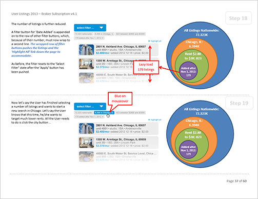
This is one of a sequence of pages that describe desirable filtering both specifically and conceptually.
Part 2: Focus on Visual Design and Core Functionality
While sorting out this project’s Information Architecture accounted for roughly half of my effort in this endeavor, I was fortunate in that the next step had already been thought through. The VP I was working with on this project had very specific ideas about the Interaction Design he wanted. This freed me up to focus on this feature’s aesthetic. Building on RentSocial’s splashy look-and-feel, I suffused Broker Subscriptions with a layer of elegant orderliness more appropriate to our new persona.

Broker Subscriptions - Main Page
Transactional core of this feature
Here we see the core user story for this feature. On the left side of the page, our broker persona has narrowed her search for apartment listings by area code and later by monthly rent. She then drags and drops the listings she wants to the right side of the page where her running total is automatically updated. In the full wireframe, we see how she can drag multiple listings at once and drag back listings she has changed her mind about. When she’s done, she clicks the ‘Pay’ button to proceed.

Excerpt from high-res wireframe.

Excerpt from high-res wireframe.